
Primrose: Tina Ramchandani Creative’s First Hospitality Project
For close to two decades, LPF Member, Tina Ramchandani Creative has been shaping the way people live inside Manhattan's private interiors. The New York studio's reputation rests on luxury residential work that is considered rather than declarative, and on a philosophy its founder has registered as Soulful Minimalism®: warmth, simplicity and thoughtful layering, with far more attention paid to how a room is inhabited than to how it photographs. It is an approach that rewards the second visit more than the first glance, which is a difficult quality to design and a rarer one to sustain.
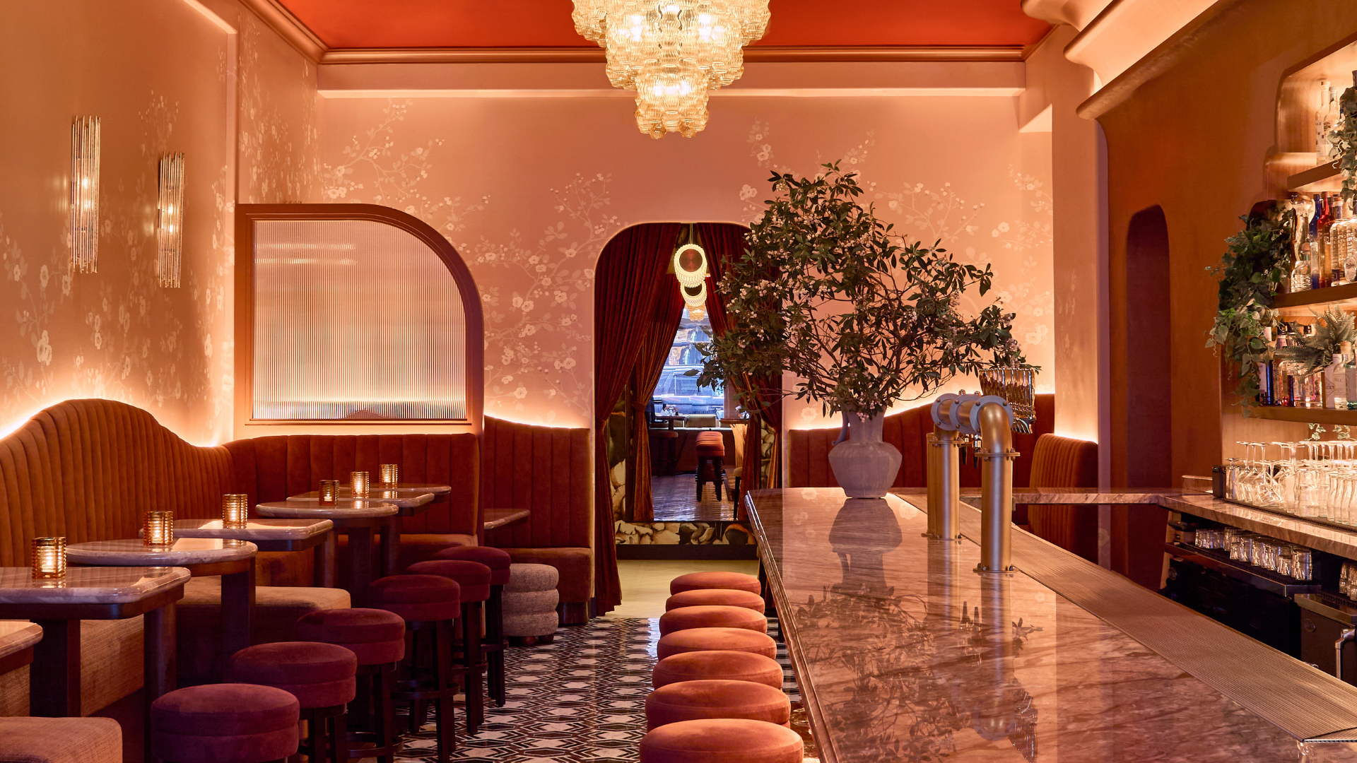
Which is what makes the studio's first hospitality project worth attention. Primrose, a new bar in Manhattan's NoMad neighbourhood, puts those residential instincts to work in a commercial room built to hold a crowd. The clearest evidence that they survive the move arrives about two thirds of the way through the venue, where the corridor turns and a mirrored surface catches you before you have quite arrived. Up to that point the evening has been pink: soft, warm, unhurried. Then the tones deepen, the light drops, and the room beyond announces itself in purple and burgundy. Nothing about the transition is abrupt. It has been prepared for since the front door.
A partnership that made the move logical
Primrose did not begin as a speculative move into a new sector. It grew out of a long-standing creative relationship between the studio and Indigo Interiors, the general contractor on previous luxury residential projects and, here, also the bar's owner. When the Indigo team identified the right space and the right partners, extending that relationship into hospitality was a natural progression rather than a leap.
That history is visible in the finished venue. Hospitality briefs frequently arrive with the concept already half decided and the room asked to illustrate it. This one arrived with trust in place and with clients willing to back creative decisions, which is usually the difference between a scheme that holds its nerve and one that hedges.
Two rooms, one vocabulary
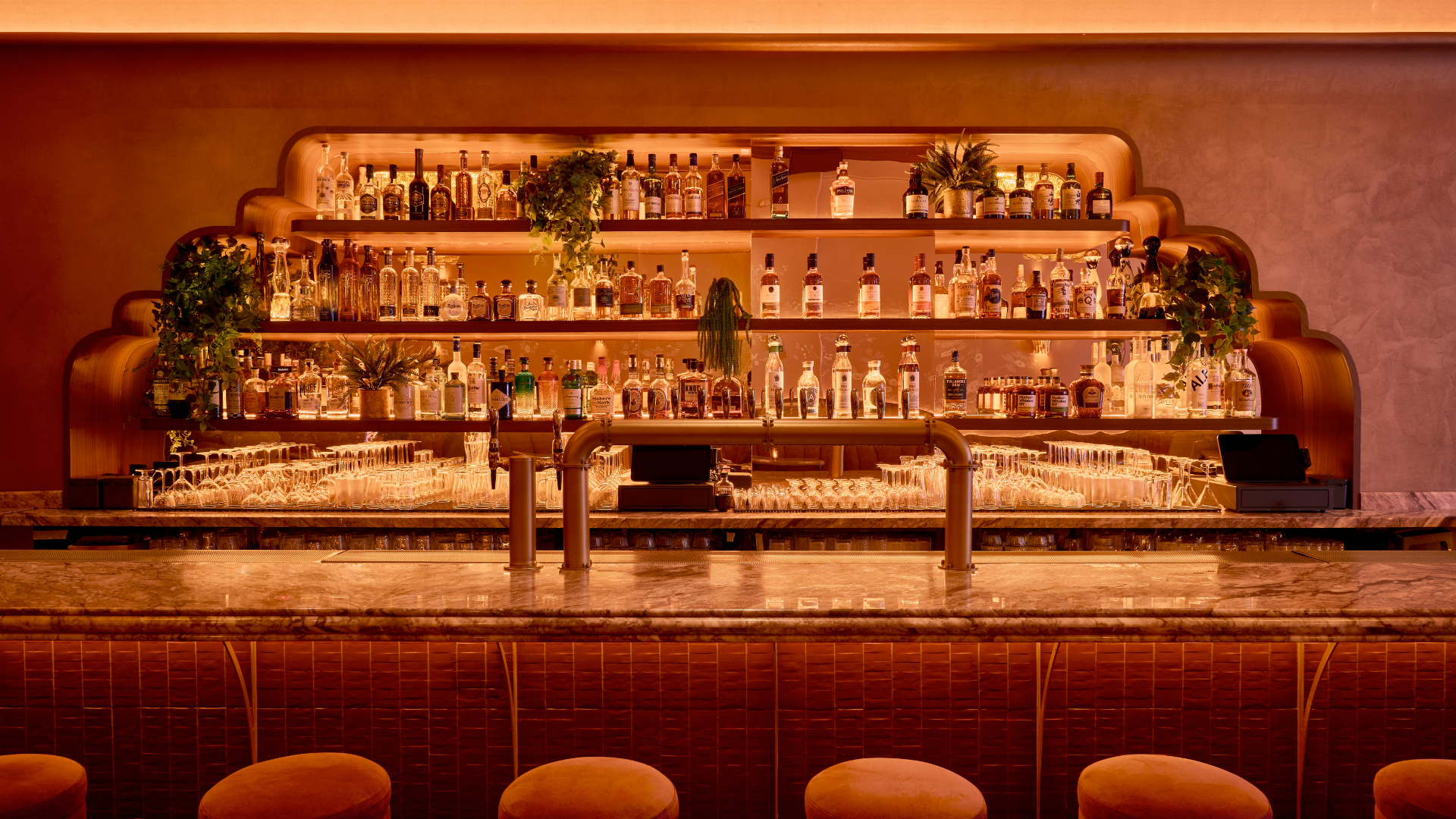
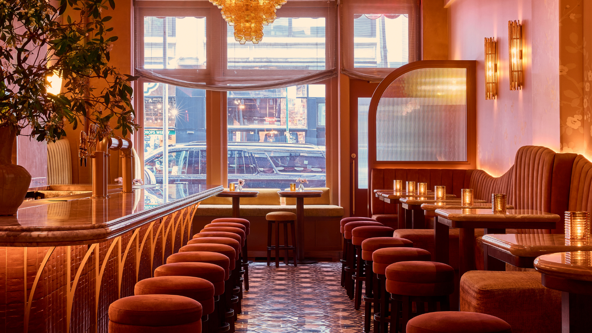
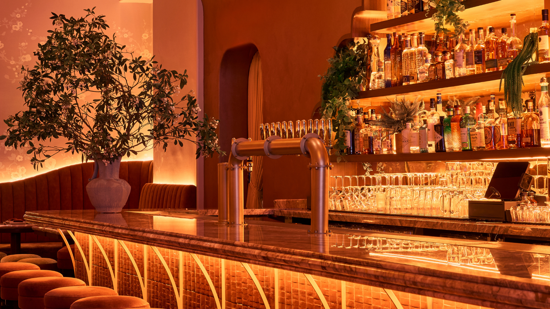
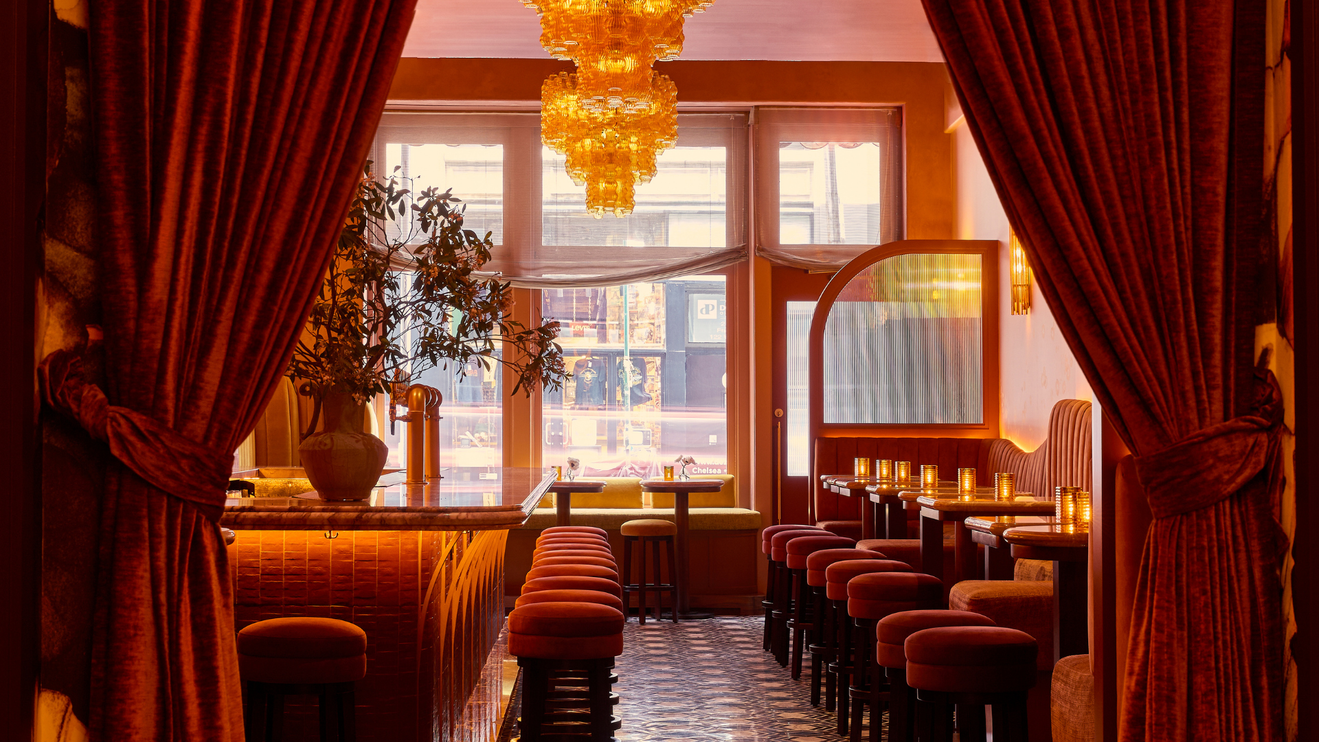
The footprint is expansive enough to carry two distinct environments without either feeling like a compromise. The front bar, Primrose, is the lighter of the pair: soft pinks, maroons and warm tones, approachable and quietly playful. It is a room you can walk into early without ceremony. The back bar is its evening counterpart, more intimate and moodier, worked in deeper purples and burgundies, with something of the modern speakeasy about it.
What stops the two reading as separate projects is the discipline of the language between them. Rather than switching concept at the threshold, the studio takes a single vocabulary of colour, form and materiality and gradually deepens and intensifies it. Day becomes night by degrees. The guest who moves from one room to the other is not being handed a different idea; they are being taken further into the same one, which is a considerably harder thing to design and a far more satisfying thing to experience.
Curves as a form of direction
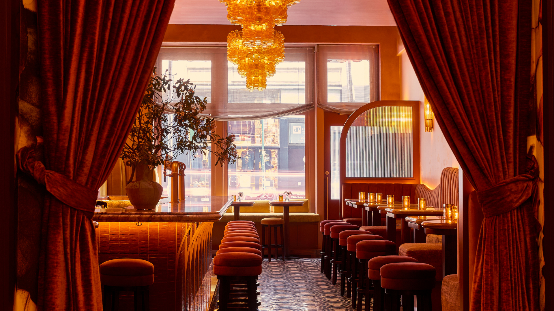
Straight lines are conspicuously scarce. Banquettes curve. Window seating softens the perimeter rather than squaring it off. Columns are wrapped in rounded forms. The champagne room is crowned by a domed ceiling, the most theatrical gesture in the venue and the one that most obviously rewards looking up.
Listed like that, these read as details. Their real function is directional. A curve implies continuation in a way a corner does not, so the eye keeps travelling and the guest tends to follow it. The result is a venue that people navigate intuitively, drifting from the bar to a banquette to the window without ever being formally routed. Movement is designed here, but it is never instructed.
The corridor works to the same end and takes the idea furthest. It could easily have been treated as a functional link between two revenue-generating rooms. Instead it becomes part of the experience: pattern and florals build anticipation as guests travel towards the back bar, the passage curves into that mirrored moment, and only then does the darker room reveal itself. Overscaled lighting makes use of the generous ceiling heights and supplies the drama that a corridor of ordinary ambition would not attempt. Anticipation, properly handled, is one of the more underrated tools in hospitality design, and it is used well here.
Interesting but comfortable
The phrase that shaped the project was that Primrose should be "interesting but comfortable, exciting but still serene". It is a more demanding brief than it sounds. Venues that chase memorability tend to sacrifice ease; venues that prioritise comfort rarely give anyone a reason to talk about them afterwards. Holding both requires knowing when a gesture has done enough work.
This is where Soulful Minimalism® earns its place in a commercial setting. The philosophy is not about restraint for its own sake but about warmth, simplicity and considered layering: interiors that feel personal and inviting rather than performed. Primrose carries genuine design moments, the dome above all, and then balances them with softness, proportion and a sense of shelter. Guests are given something to notice and, immediately afterwards, a reason to stay.
What residential design already knows
This is the part of the project with the widest relevance, because it says something about where high-end design is heading generally.
In a sophisticated private home, success is rarely a matter of one impressive visual moment. It depends on understanding how people will actually use a room, where they will gather, what makes them comfortable, how spaces relate to one another and how an interior reveals itself over months rather than minutes. Primrose was approached through much the same lens, with the additional advantage that a designer used to residential scale knows how to introduce intimacy into a large commercial volume, which is precisely what the back bar and the champagne room achieve.
The designer's own account of it is worth quoting at length.
“Hospitality has been something I’ve wanted to explore for a long time, but I was waiting for a project that felt genuinely exciting and for partners who were willing to take creative chances. Primrose was exactly that. What I loved most was being able to think about design through the lens of an experience – not only how a space looks, but how someone moves through it, where they want to linger, and how their mood changes from one room to the next.
What surprised me through the process was how much of what we do in luxury residential design translates directly into hospitality. In both, you are creating an environment for people to actually live in and enjoy. The scale and energy may be different, but comfort, flow, proportion and emotion are just as important.”
That is the case for the two disciplines converging, made by someone who has now worked in both. The common denominator is how a space makes a person feel. The best interiors manage the difficult trick of landing immediately and then making somebody want to remain. Primrose has more theatre than a residence would tolerate, but the principles beneath it are the familiar ones: thoughtful, layered and memorable without ever feeling overly designed.
Firsts of this kind are usually judged on whether a studio has adapted convincingly to unfamiliar territory. The more accurate reading of Primrose is that the territory was less unfamiliar than it appeared, and that a design vocabulary developed in private homes has proved robust enough to hold a room full of people on a Friday night. For The LPF, watching a member extend its practice with this much clarity of thought is exactly the kind of progress worth marking.

About Tina Ramchandani Creative
Tina Ramchandani is the founder and creative director of Tina Ramchandani Creative, a New York City interior design studio working across luxury residential interiors and boutique hospitality projects.
With nearly two decades of experience, she is known for Soulful Minimalism®, an approach that balances warmth, simplicity and considered layering to produce interiors that feel timeless, personal and genuinely inviting. She refined her craft at leading Manhattan firms including Vicente Wolf Associates before establishing her own studio on the conviction that design should improve the way people live. Projects begin with a detailed understanding of how clients actually spend their days, which is why the studio's work tends to read as refined but comfortable, elevated without being precious, and built to be lived in for years rather than admired briefly.
The studio's work has appeared in Architectural Digest, ELLE DECOR, The Wall Street Journal, House Beautiful, Homes & Gardens, Cottages & Gardens, Lonny, Gotham and Cover. Recognition includes House Beautiful Next Wave designer, D&D Building Star on the Rise and the Cottages & Gardens Innovation in Design Award.
Tina leads the studio alongside her team, working with discerning clients on highly personalised interiors that combine functionality, beauty, calm and connection. Tina Ramchandani Creative is a member of The Luxury Property Forum.
get in touch
To find out more about Tina Ramchandani Creative, please contact the team using the details below:
Visit their website: www.tinaramchandani.com